

Some time in the early 1970s, I got a few of these color-pencil-by-numbers sets as Christmas gifts. For young Cygnus, the color pencils were a godsend. I loved the ubiquitous Crayola rainbow, but wax crayons left a lot to be desired. They couldn't give you the fine lines of a pencil or pen... and if you stacked up a few of your creations on top of one another, the papers would stick together and get kind of goopy after a while.
I was fascinated by one particular brand... the Venus Paradise pencils, which had their own unique color palette. Each color was assigned to an evocative name and a specific number in an esoteric sequence. The numbers corresponded to the digits on the color-by-numbers outlines, but I don't remember filling in many of them. I tended to just hoard the pencils and draw other stuff with them (and I still have some nubs left in a box somewhere).

So, a few months ago, I discovered a massive, labor-of-love web site for Crayloa crayon collectors. Over the years I've also seen quite a few attempts at creating web-based color palettes out of the classic crayon colors. But where's the digital love for Venus Paradise? Someone might want to re-create their childhood color-pencil artwork as accurately as possible. Okay, Cygnus (plus some image-grabbing software) to the rescue.
1. Deep Yellow: (247, 210, 039), #F7D227
2. Sarasota Orange: (245, 120, 057), #F57839
3. Poppy Red: (231, 067, 069), #E74345
4. Hollywood Cerise: (255, 111, 145), #FF6F91
5. Orchid Purple: (089, 062, 103), #593E67
6. Navy Blue: (022, 057, 108), #16396C
7. Peacock Blue: (078, 195, 239), #4EC3EF
8. Emerald Green: (036, 179, 134), #24B386
9. Deep Chrome Green: (024, 092, 069), #185C45
10. Photo Brown: (136, 068, 032), #884420
11. Chestnut Brown: (067, 047, 026), #432F1A
12. Midnight Black: (017, 017, 016), #111110
13. Ultramarine Blue: (059, 123, 210), #3B7BD2
14. Natural Flesh: (246, 224, 181), #F6E0B5
15. Lawn Green: (056, 134, 079), #38864F
16. French Green: (203, 215, 087), #CBD757
17. Smoke Gray: (159, 153, 146), #9F9992
18. Blush Pink: (251, 133, 126), #FB857E
19. Cherry Red: (217, 057, 064), #D93940
20. Arizona Topaz: (243, 208, 119), #F3D077
21. Indian Red: (174, 064, 042), #AE402A
22. Sky Magenta: (208, 123, 154), #D07B9A
23. Cotton White: (254, 253, 253), #FEFDFD
24. Lemon Yellow: (253, 243, 132), #FDF384
25. Bright Gold: (195, 170, 117), #C3AA75
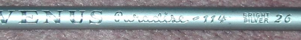
26. Bright Silver: (155, 185, 190), #9BB9BE
27. Sky Blue: (104, 192, 236), #68C0EC
I so love those color names. If I ever write a noir-ish crime drama, I'm sure I'll steal at least three or four character names from the above list. I think #4 and #17 must be having an affair.
Here's what the digital RGB colors look like in graphical form:

Please do whatever you like with this information. I'm still not sure why it's ending up on this blog. I just know I had a blast putting it all together. Right now, that's enough for me.
I should note that I never owned numbers 25 or 26. According to the web, these two were the rarest colors of the bunch. It took me a while to even find an image of #26 (see below... ain't it bee-u-tee-ful?). For #25 I had to go slumming with online images of other brands to even begin to guess what "Bright Gold" might look like. I'll find one someday! :-)
I've nominated you for an award on my blog.
ReplyDeleteHey there, Squid. Thanks so much! I'll follow ze rules and cook up a post in response. :-)
DeleteYou know, for me the whole concept of color as quantifiable is mind blowing. Obviously, it is. Otherwise there would be no colors on my computer screen. Still, my artistic heart wants it otherwise.
DeleteInteresting... I don't know if I'd be so fascinated by colors if they weren't so quantifiable. :-)
DeleteI feel the same way about musical pitches. Just as Pythagoras said, everything is number.
DeleteThis is an idea that I've mulled over lots of times on this blog... but I'm no closer to an "a-ha" moment than I was a few years ago. :-)
DeleteYes, I remember that discussion. Of course, you're "A-ha" has my brain singing: "Take on me..."
DeleteI have a number of the pencils leftover from various Venus® Paradise coloring sets. They were a great thing at the time. They seemed to have disappeared sometime in the 1990s to my best guess. Someone ought to bring them back. I would buy one just for the fun of it.
DeleteThanks for popping in! I suppose there must be some high-end art pencils out there that are kind of similar to these old classics, but I wouldn't know where to start looking... or how to even know for sure, if searching online! :-)
DeleteI just added two unsharpened Venus Paradise pencils to my collection - #23 Cotton White and #26 Bright Silver. Like many coloring their pictures in the 1970s, those missing three (23, 25, and 26) were maddening. It was not until the 21st century that I discovered what those colors were. The picture you included of the pencils was taken by me on 19 July 2014 in my driveway and submitted to "The Museum of Forgotten Art Supplies". (Yes, I'm Ed Dietrich despite the blog informing you that it's Andrew Lundy commenting - that's pulled from my gmail.) It's always delightful to see others remembering these wonderful pictures and pencils. If you want to include any colored pictures in your blog post - let me know, I still color to this day and much better than I did when I was eight.
ReplyDeleteThanks, Ed! I've been kind of wanting to give coloring a try again, too. I'm not sure if I'd want to risk using any of my original VP remnants, though. I'll have to take a trip to the art store to see what's new...
Delete